Phantom Parlor Bar
Business Overview
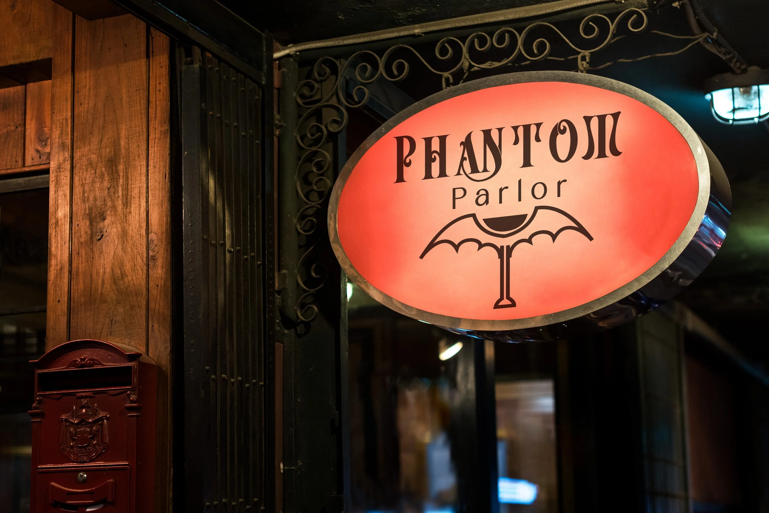
Phantom Parlor is an immersive entertainment venue that blends a gothic-vampire-themed bar and restaurant with a neon-spooky indoor mini golf course. Designed to operate in major entertainment hubs—Las Vegas, New York, Miami, and Los Angeles—the brand needed a cohesive identity that works across nightlife, dining, and family-friendly attractions. The identity combines gothic typography, a dual dark-and-neon palette, and a flexible set of marks used across menus, signage, merchandise, and digital platforms. This ensures the brand feels unified whether guests are sipping cocktails or playing under blacklight.
Central logo inspired by gothic typography with subtle paranormal elements
Secondary marks: vampiric sigil + neon ghost mark
Color palette:
Primary: blood red, obsidian, midnight violet
Secondary: neon green, electric blue, ultraviolet
Typography pairing: ornate serif + modern condensed sans
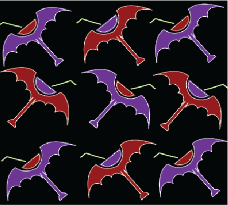
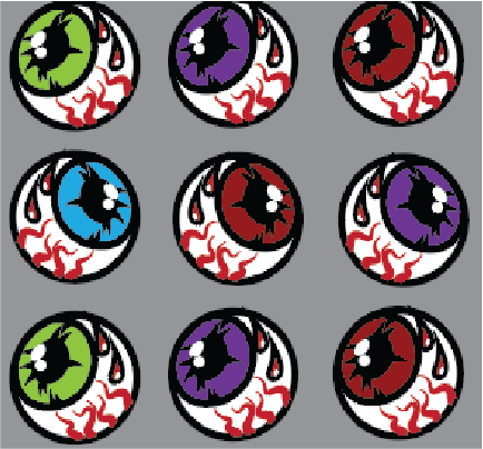
Pattern assets for interiors, packaging, and merchandise
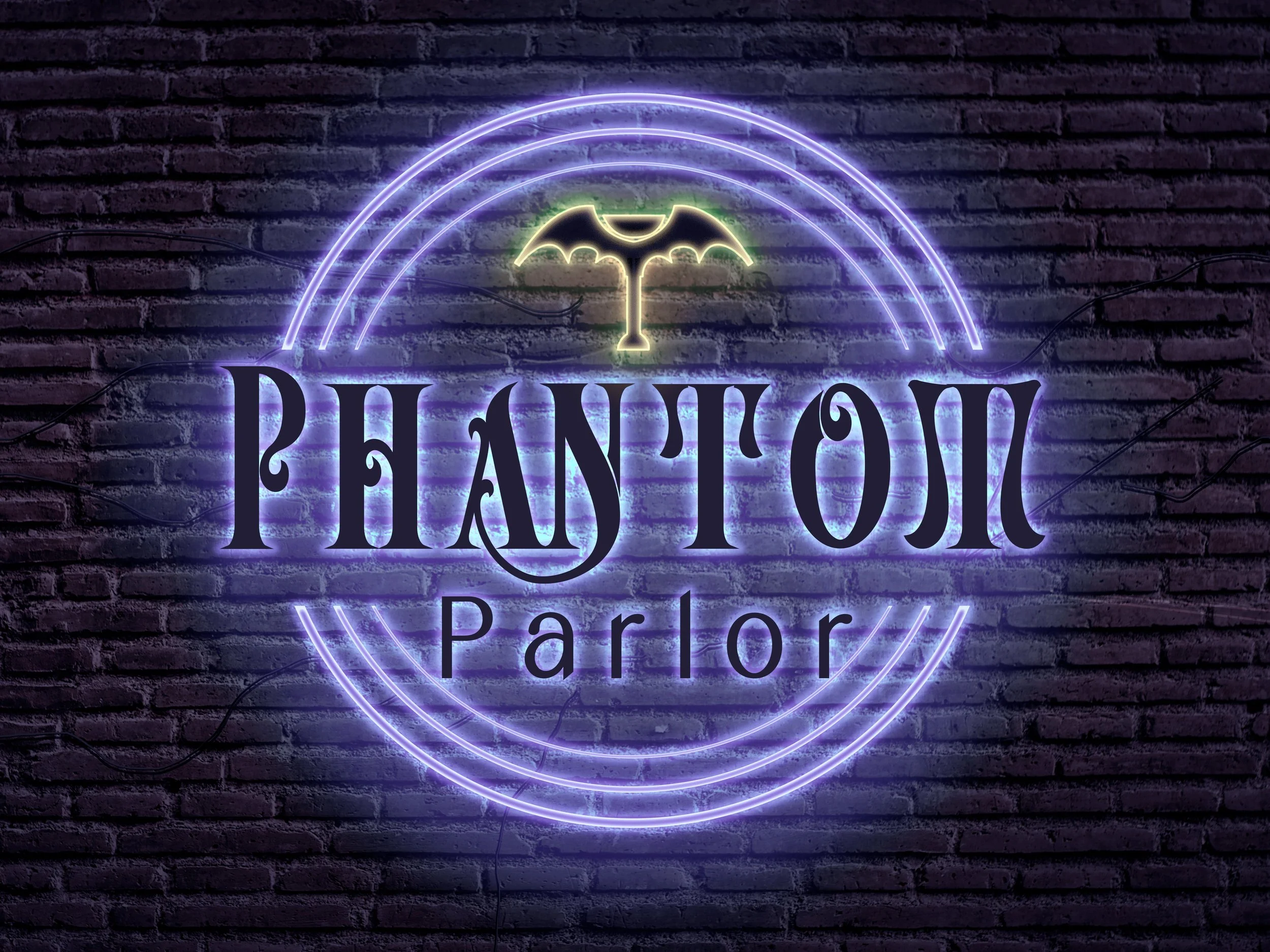
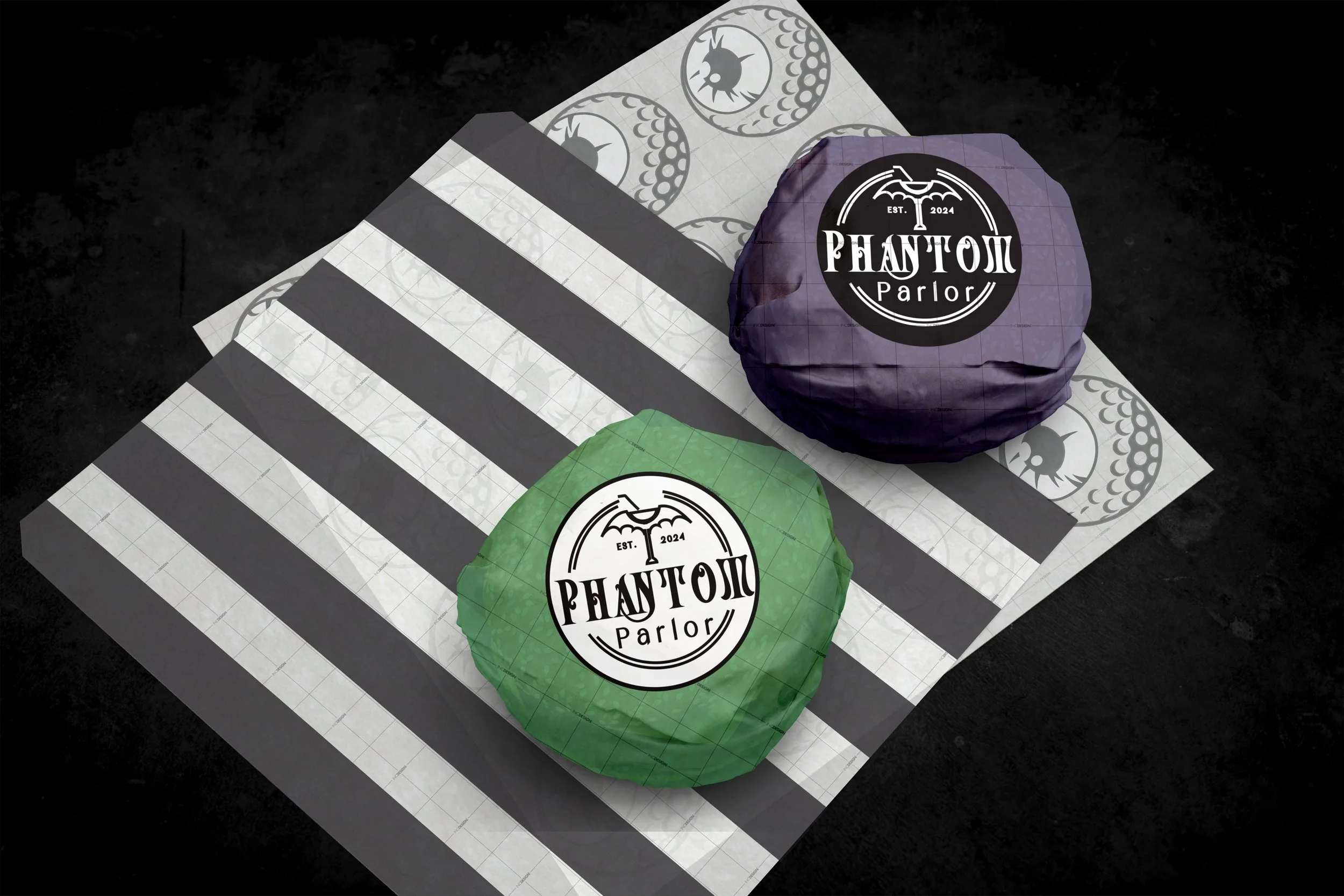
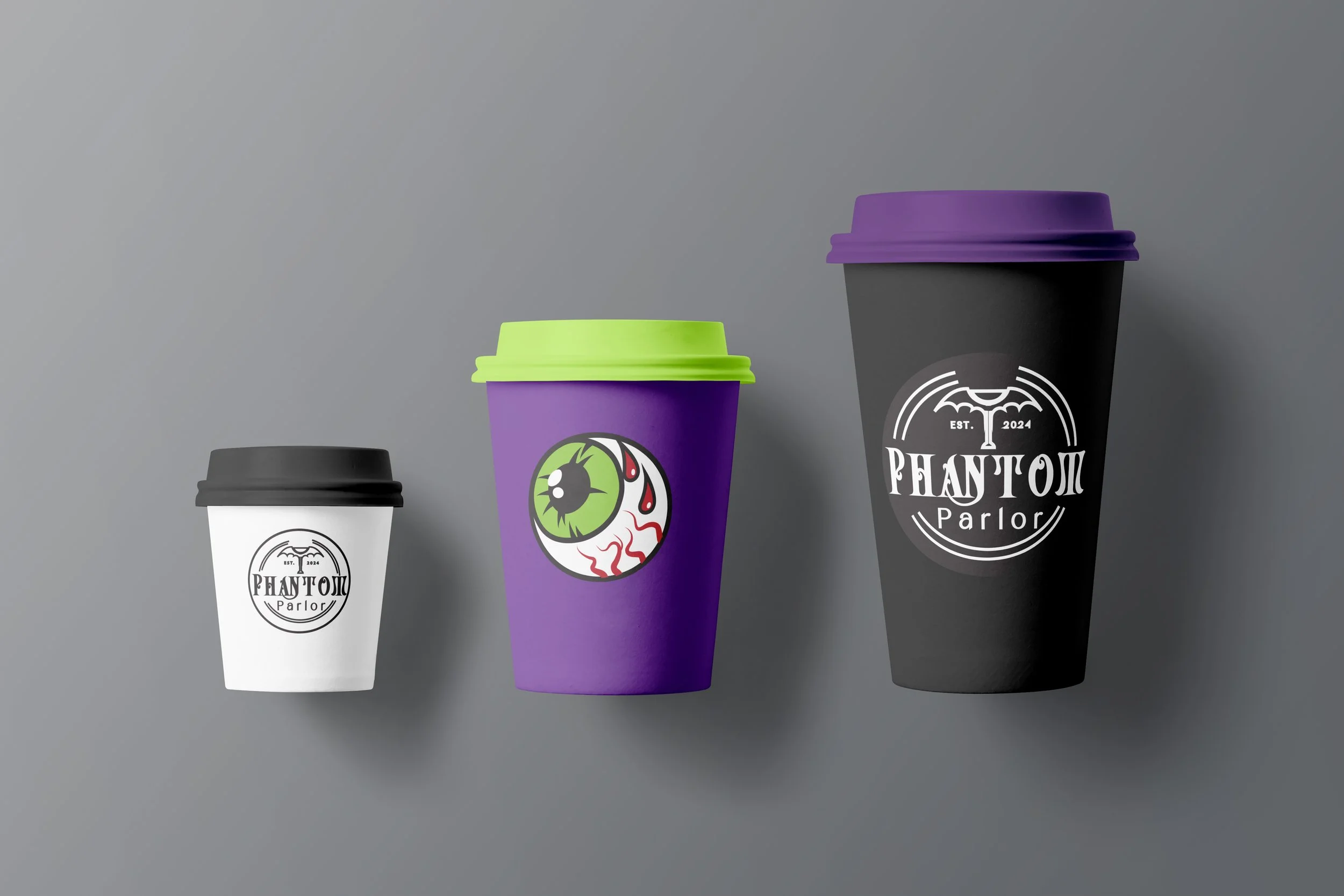
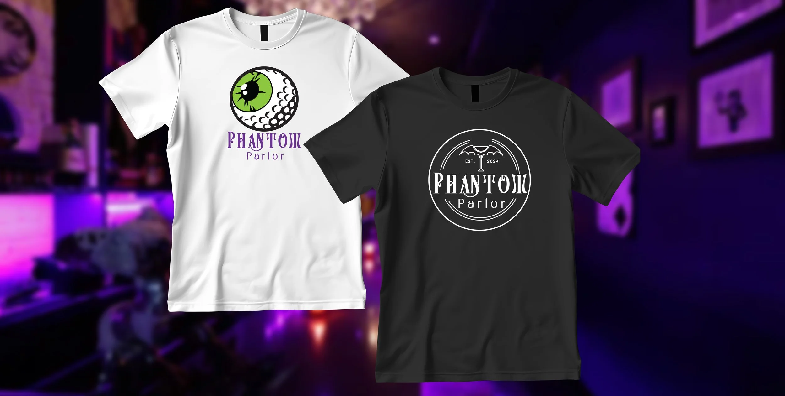
The eyeball illustration was developed as a secondary entertainment icon. It serves as a mascot-like brand moment—fun, spooky, and highly shareable. The logo uses a circular badge structure, making it adaptable to multiple packaging formats while remaining clean and readable on curved surfaces.
The martini bat was created for merchandise as well as being utilized for various packaging formats.

Merchandise Overview
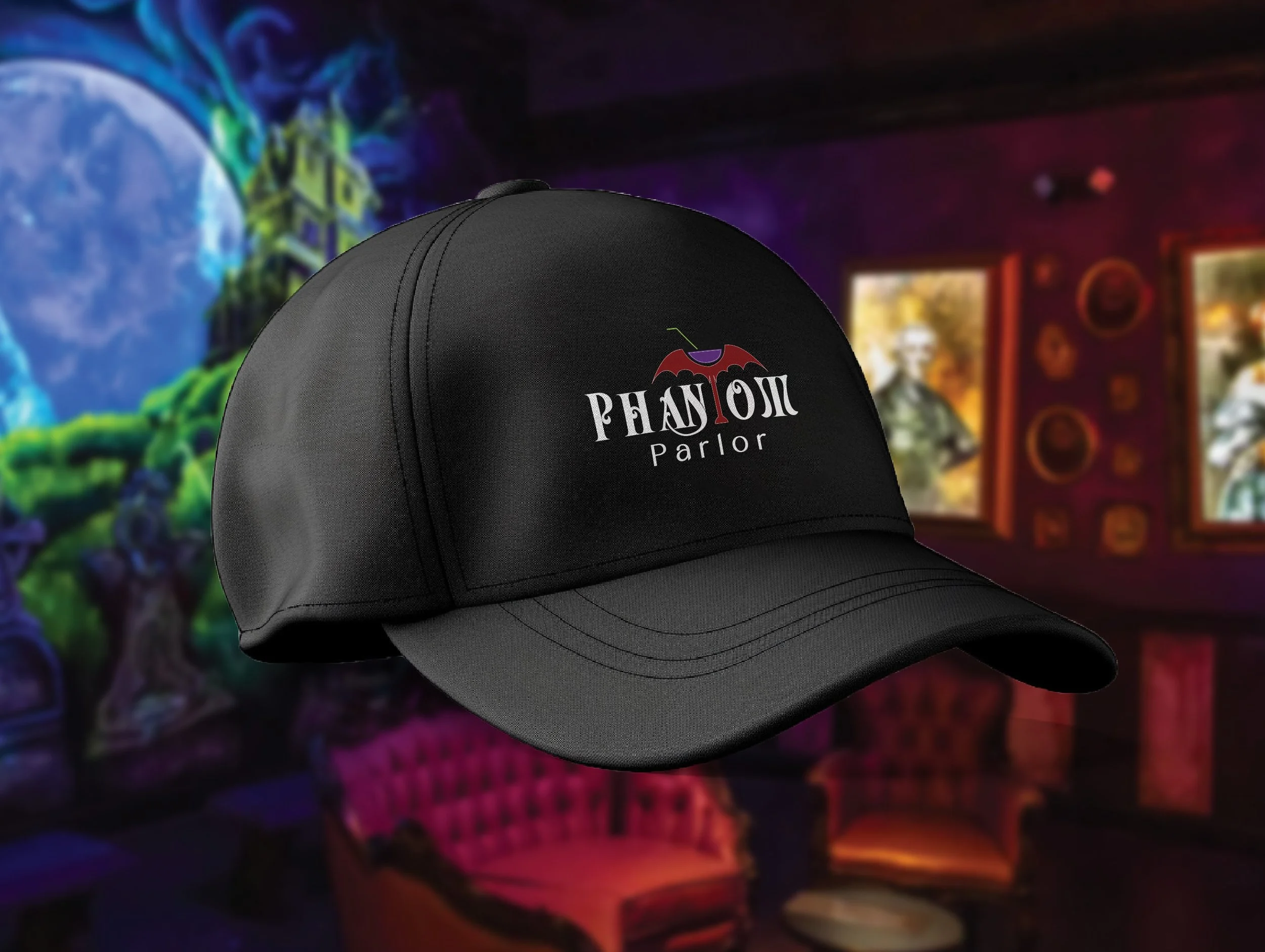
The baseball cap serves as the hero item for the entertainment side of Phantom Parlor.
Design Intent:
Capture the playful, neon-spooky personality of the mini golf zone
Create a bold, instantly recognizable statement piece
The t-shirt focuses on the more refined, gothic side of the brand.
Design Intent:
Create a clean, versatile shirt that represents the core identity
Prioritize a design that feels wearable both inside and outside the venue
Tray liners were designed to unify the food service component across both environments.
Repeating pattern of small brand icons (eyeballs, stripes, phantom logo)
Light-to-mid gray tones that don’t distract from food presentation
Edge-to-edge design to align with tray dimensions and added purple and green color for balance
Cups were designed to cohesively connect with the rest of the food components. I wanted to incorporate the brand colors and other
Product Packaging