

Casa Arepa
Crafting the Menu Experience
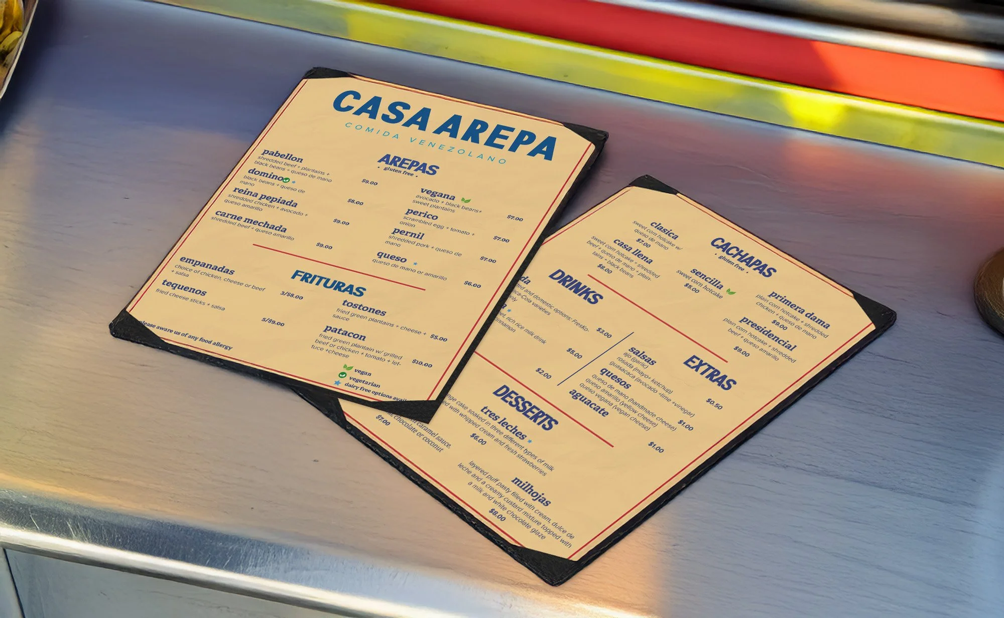
Clean typography kept the menu legible at a glance, and small icons helped communicate dietary options. The final menus were mocked up on the truck counter to show how they function in a real service environment.
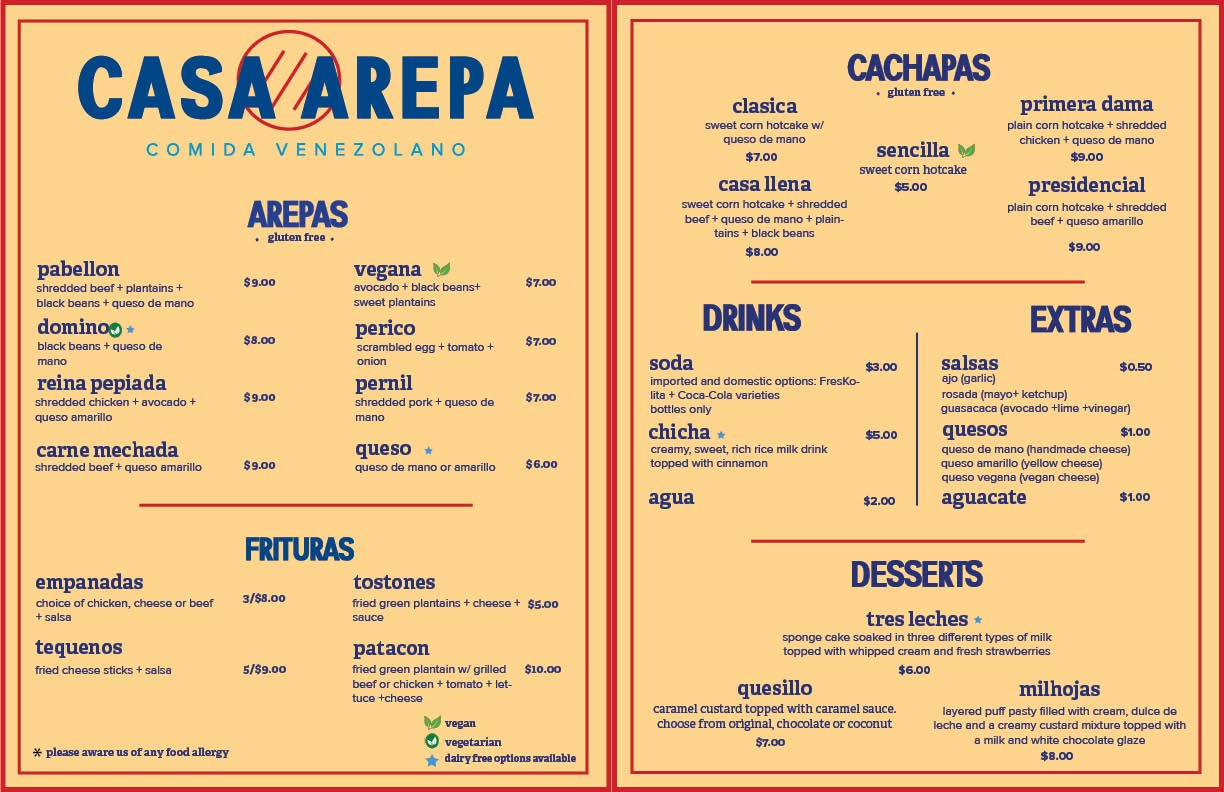
The goal was to make ordering intuitive, fast, and enjoyable. I organized the menu into clearly defined sections such as Arepas, Frituras, Cachapas, Drinks, and Desserts, ensuring customers could quickly identify what they wanted.

Building Social Media presence
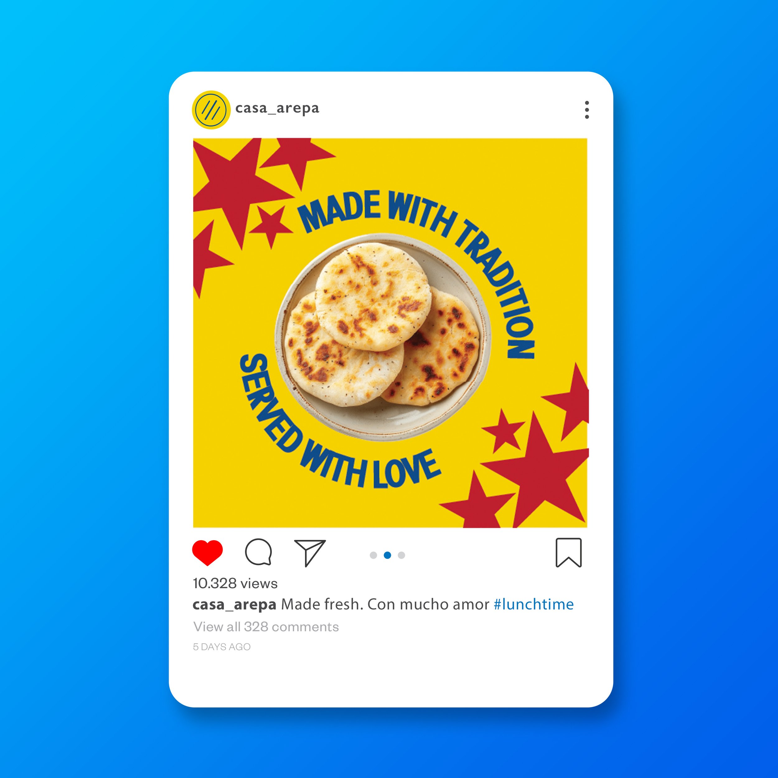
Minimal layouts and high-contrast compositions were used to stand out in fast-scrolling environments like Instagram and TikTok. These visuals help communicate freshness and authenticity while building recognition for the brand both online and on the street.
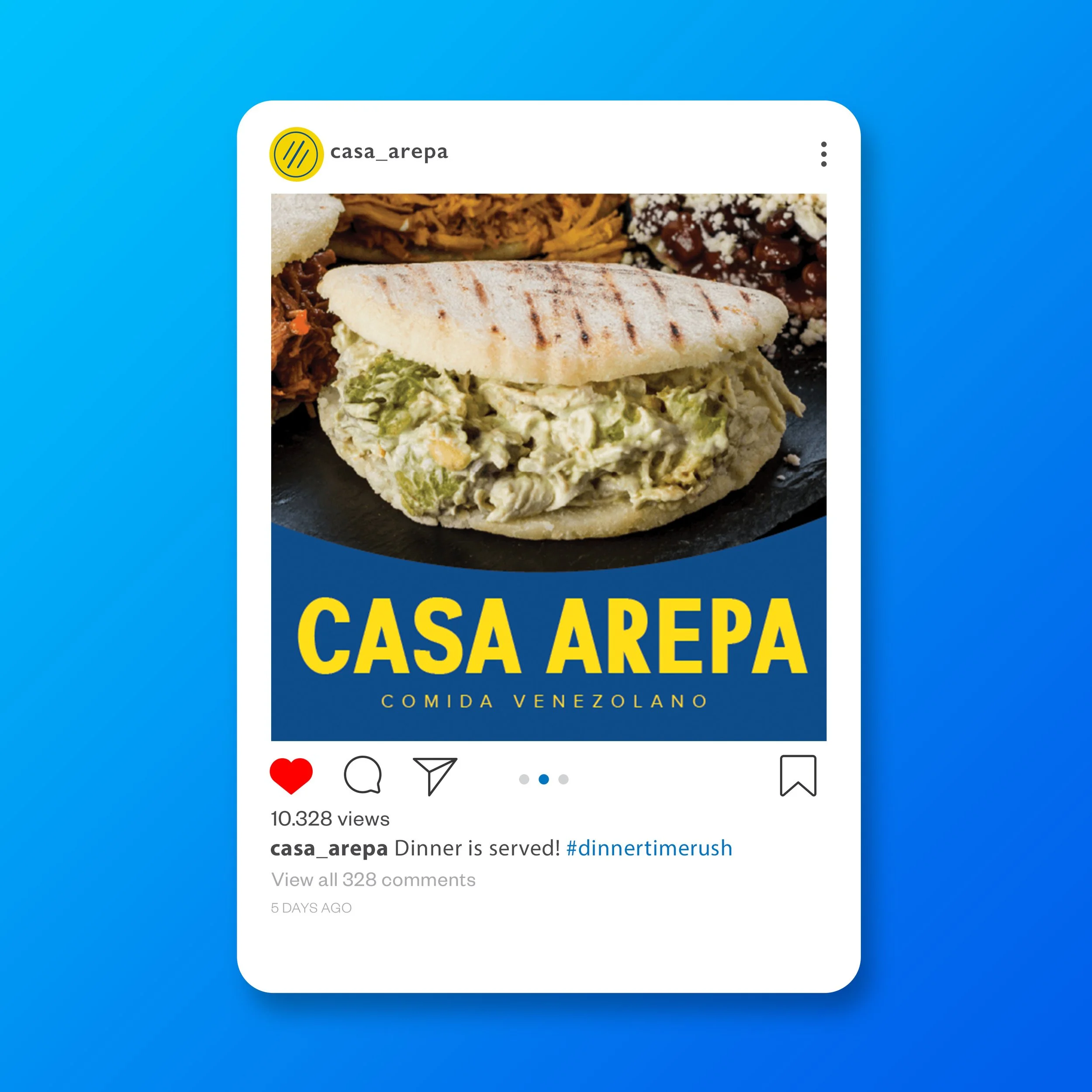
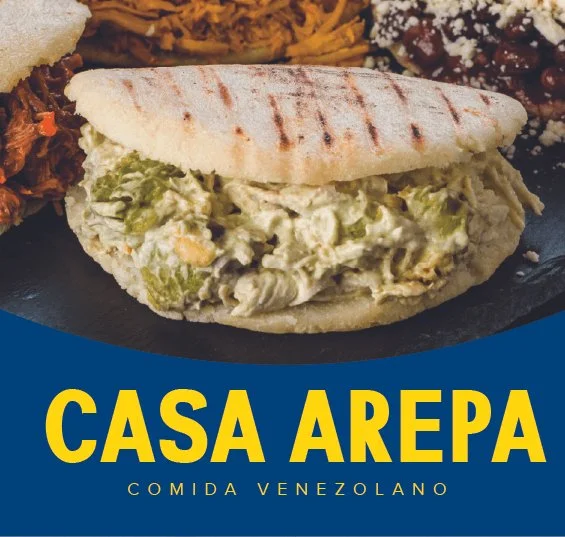
Finally, I expanded the identity into social media ads designed to draw customers to the truck. The approach centered on mouth-watering food photography—showcasing textures, fillings, and the iconic shape of the arepa. Each ad incorporates the bold Casa Arepa typography and signature colors to maintain brand continuity across platforms.
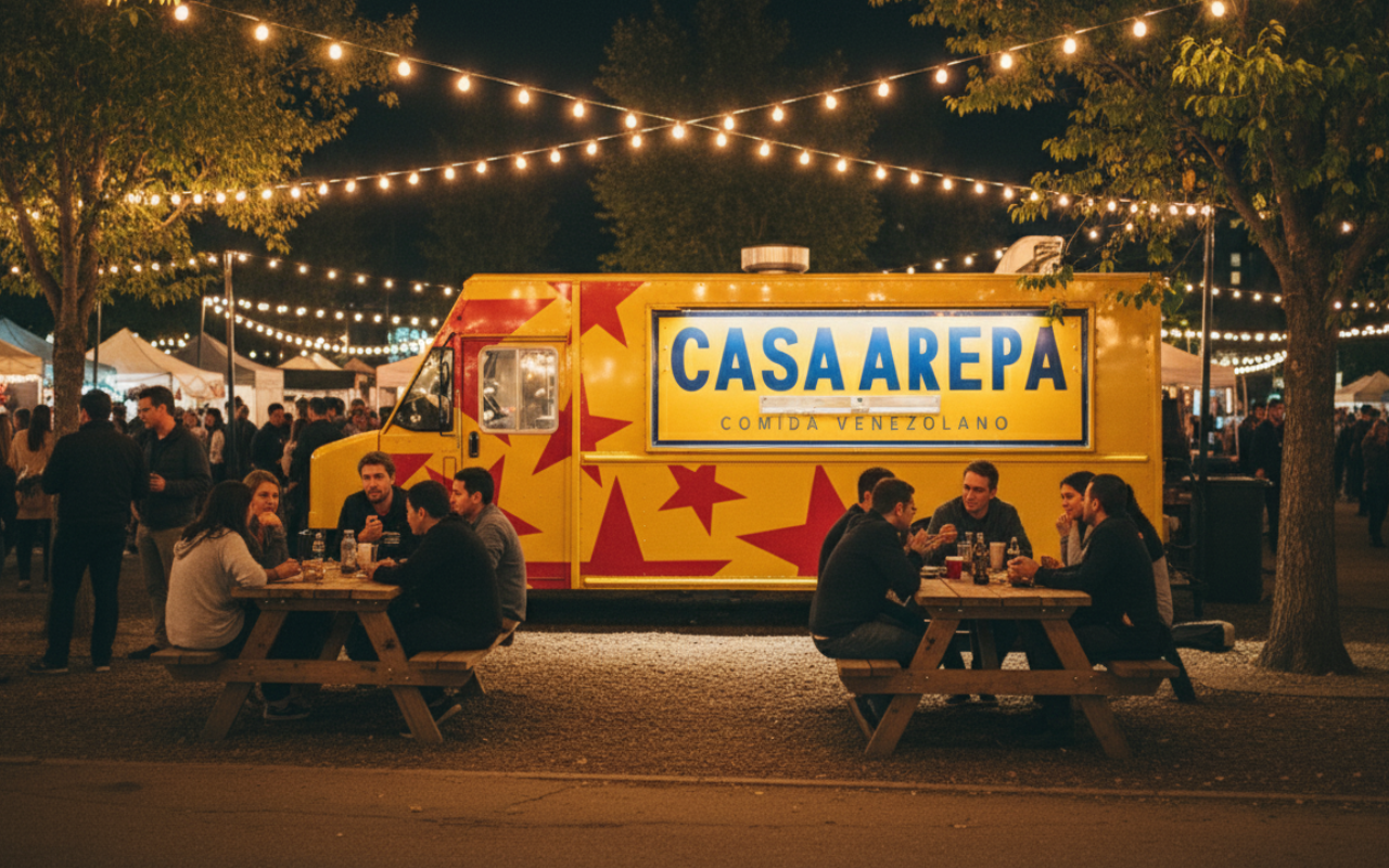
Designing the Food Truck
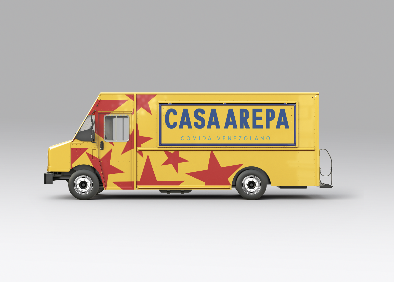
This color palette not only reflects national pride but also creates strong contrast that cuts through the visual noise of busy food markets. The oversized “CASA AREPA” lettering ensures read-ability from afar, while the red star pattern adds rhythm and a sense of celebration. Mockups were created to test how the design performed under string lights and ambient nighttime conditions, guiding refinements to contrast and placement.
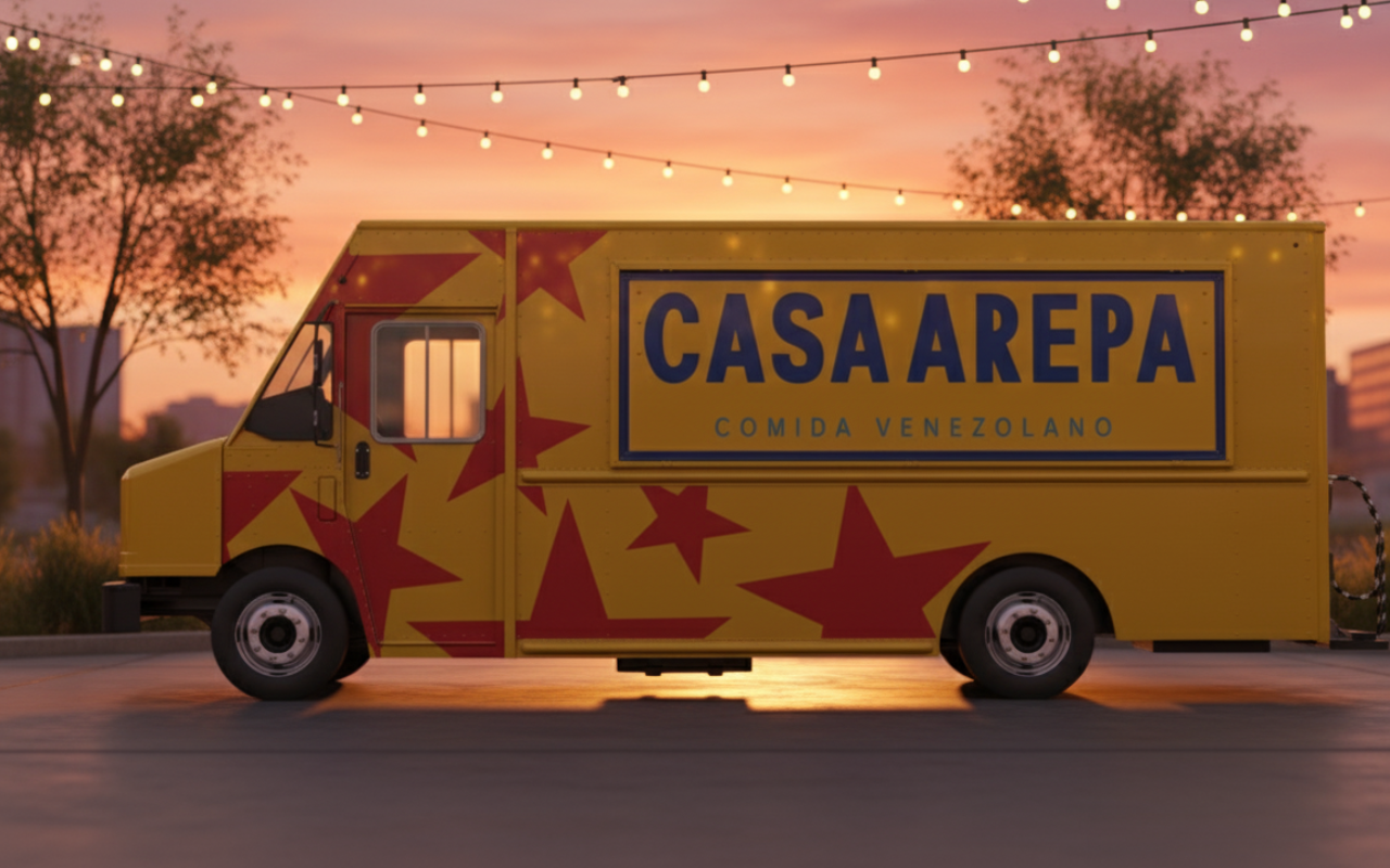
The truck exterior was the foundation of the brand—its largest, most visible canvas. I explored compositions that would maximize visibility and make the truck instantly recognizable, even in low-light festival settings where Casa Arepa often operates. The final direction features a bright yellow base paired with bold blue typography and red star graphics inspired by Venezuelan iconography.