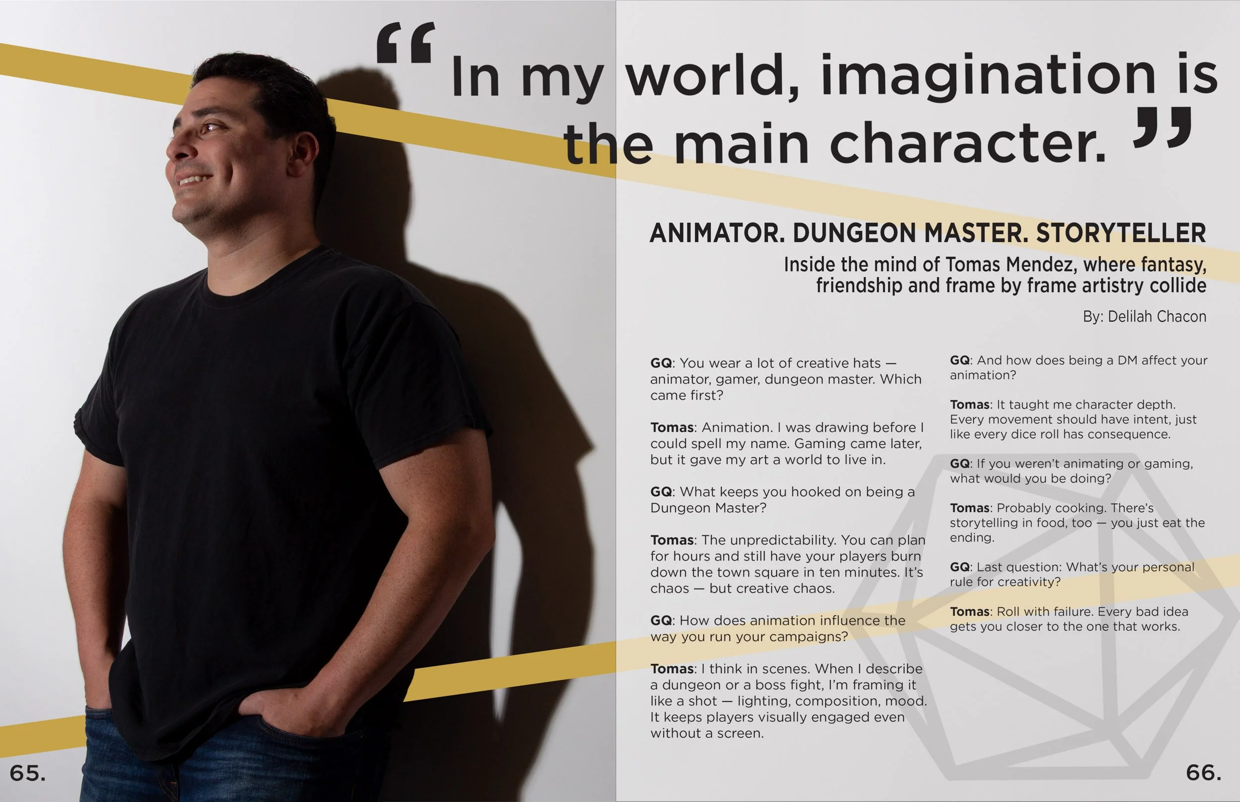
GQ Magazine Cover
Concept development
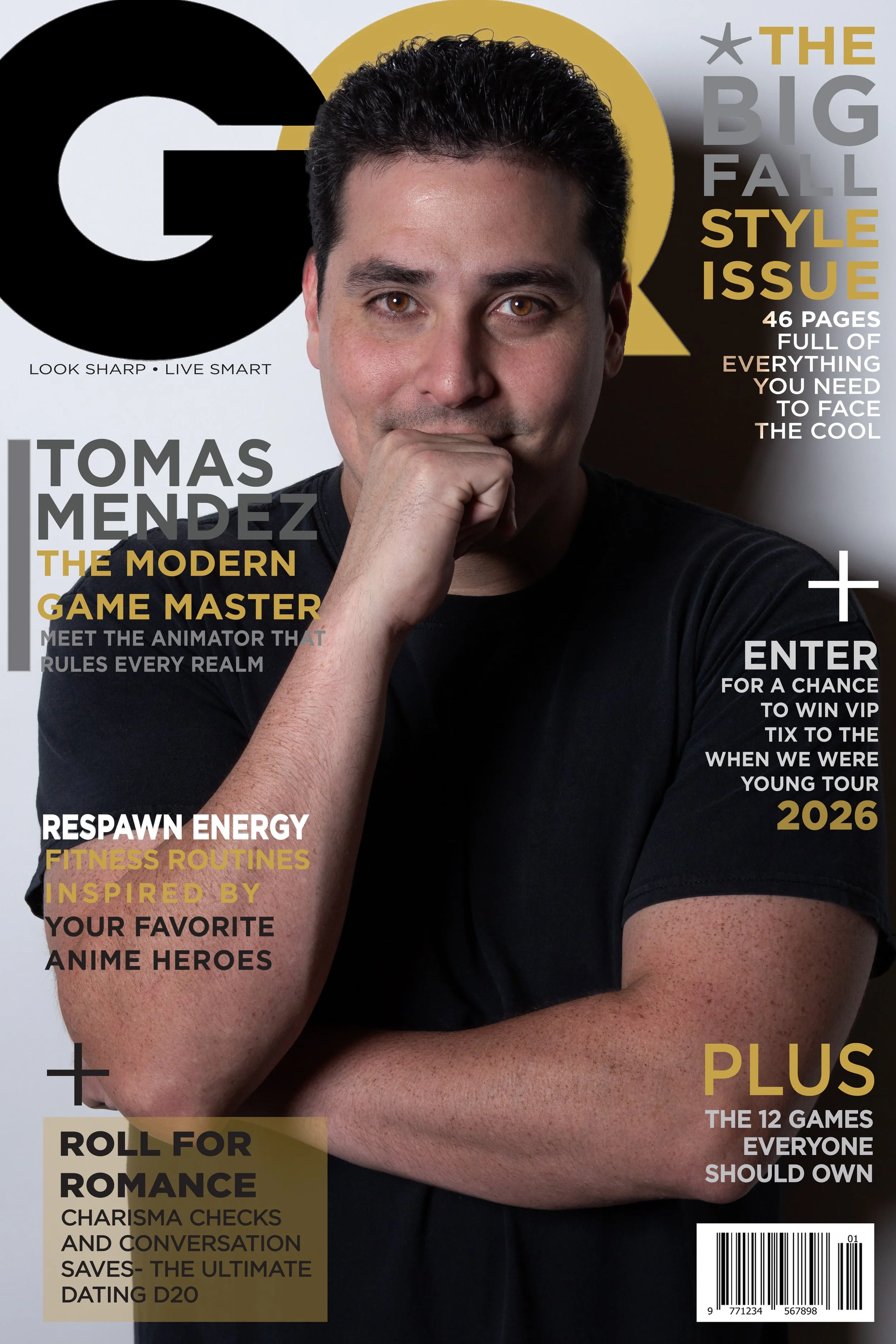
The goal of the cover was to merge sleek editorial aesthetics with a modern, game-inspired personality, matching the subject’s creative profession. Early sketches focused on balancing the boldness of a men’s lifestyle magazine with visual cues from gaming and animation culture—clean lines, modular blocks of text, and high contrast headlines.

Typography
Typography was the most important design element—creating rhythm, hierarchy, and personality.
A mix of bold sans-serif fonts reflects:
Editorial strength
Modern gaming culture
Clean legibility