Haunted Mansion
Attraction Poster
Design Concept and Development
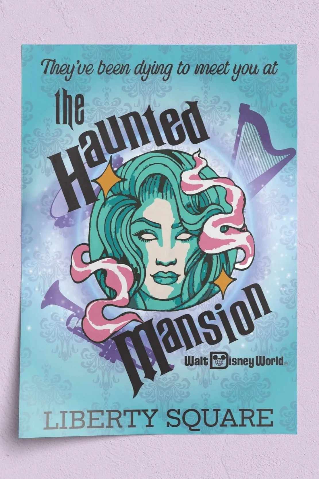
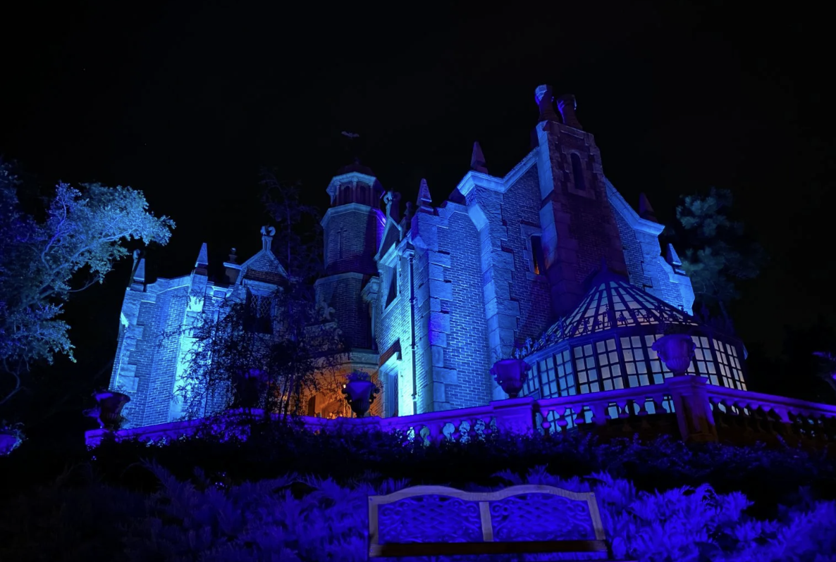
The goal was to create a modern yet mystical poster inspired by The Haunted Mansion at Walt Disney World. I focused on evoking the attraction’s iconic eerie charm through a blend of ghostly elegance, vintage Disney nostalgia, and contemporary illustration. Early sketches explored Madame Leota–inspired imagery paired with swirling supernatural elements to anchor the visual narrative.
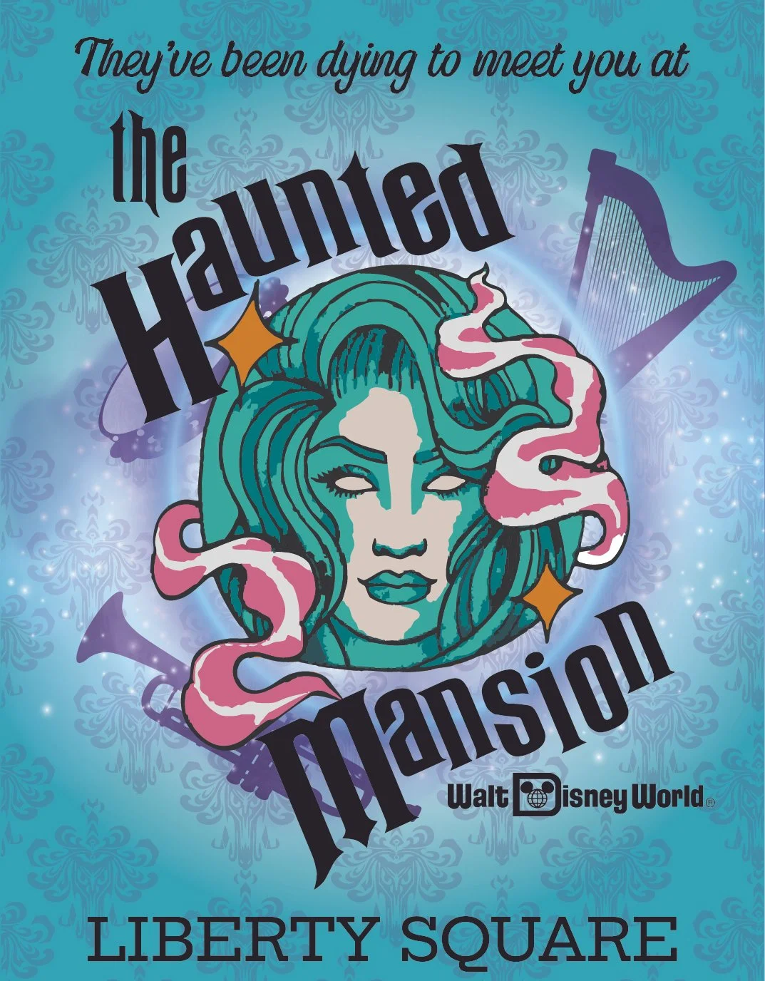
The central illustration features a stylized spectral portrait framed by flowing, smoke-like shapes that reference the attraction’s séance scene. A teal and violet color palette reinforces the supernatural mood, while glowing highlights add depth and an ethereal presence. Background damask patterns emulate the Mansion’s infamous wallpaper, tying the art direction back to the ride’s theming.

Typography
Typography plays a key role in capturing the identity of The Haunted Mansion. The wordmark uses a bold, distorted serif type reminiscent of classic Disney attraction posters, giving it a dramatic, hand-lettered feel.
“Haunted” and “Mansion” are angled for dynamic movement, echoing the ride’s whimsical-but-spooky tone.
The smaller “the” is set in a gothic typeface to enhance the vintage haunted-house aesthetic.
The tagline “They’ve been dying to meet you” uses a playful script to balance the heavier logo and introduce a humorous, pun-filled tone consistent with the attraction’s personality.
Together, the typography acts as both branding and storytelling, grounding the poster in the unmistakable identity of the attraction.